


Anyone considering starting a business, whether as a retailer, manufacturer, or service provider, must have an idea of their potential market. Consumers have different needs, wishes, and priorities, at different stages in their lives. Economic conditions also influence consumer behavior.
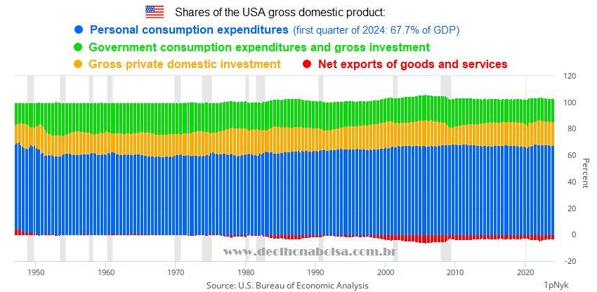
Personal consumption expenditures happens to be the lion's share of the largest economy in the world. It represents two thirds of the gross domestic product of the United States of America.
The US is the third most populated country in the planet, but its population has more purchasing power than those of India and China. As the USA is the leading importer country in world trade, its consumer market impacts different exporting nations. This also affects the availability of dollars in foreign economies all across the globe.
Since the 1944 Bretton Woods agreement, the US dollar became the most important form of international reserves. It is the most used currency in cross-border financial transactions and in the international trade of goods and services. Many foreign corporate bonds, and significant amounts of credit for global industries, are issued in US dollars. The global access to these dollars is reflected in the way maturing debt gets paid or rolled over in foreign economies. The huge offshore Eurodollar market, which finances a significant portion of the global economy, is also influenced by US domestic activity. Americans investing in other developed or emerging markets could also be affected by fewer foreign exports and possible debt restructuring, or defaults, caused by a dollar shortage crisis. The global economy is interconnected.
The largest economy in the world is not an island. The pulse of US consumers has worldwide repercussions.
Ten years ago, I created the Tocalino Index, which suggests the potential of the US consumer market. I will briefly discuss each variable involved in its calculation, and provide permanent links to download the monthly updates of all official historical data, directly from the Saint Louis Federal Reserve Economic Database (the St. Louis FRED).
Population:
The US Bureau of Labor Statistics has shown that American households whose main providers are between the ages of 25-54 have a growing share of national aggregate consumption. As young people become productive, many will marry and have children. Generally, as they get older, with more responsibilities and ambitions, they will work, earn, and spend more, until they reach their mid-50s.
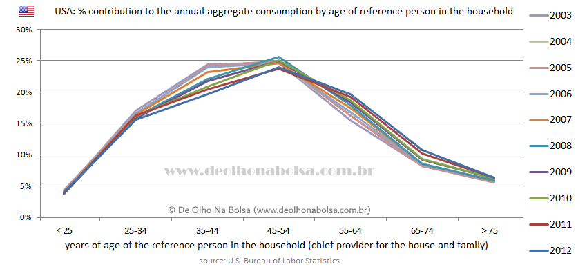
A growing number of people in this 25-54 age range is a tailwind for the consumer market.
The US population within this relevant age group is published and updated by the Saint Louis FRED. Historical numbers can be downloaded directly from the Fed's repository in this CSV file (comma-separated value format) or this XLS spreadsheet.
On the other hand, when most people reach their late fifties, due to aging concerns and retirement outlook, they will strive to save more money and consume less, as they advance in their senior years.
Unemployment:
People deprived of work and income cannot consume much. So the unemployment rate is an important variable too. Monthly updates of the unemployment rate can also be retrieved from the St. Louis Fed. Here are the links for the CSV file and the XLS spreadsheet.
Core inflation:
Inflation raises the cost of living and reduces the purchasing power of consumers. Why use core inflation, which excludes food and energy? Because people will still buy food for their nourishment, energy for their homes and appliances, and fuel for heating and transportation. But they will avoid other more expensive discretionary goods and services. Access the Saint Louis Fed CSV file and XLS spreadsheet with the monthly updated history of 12-month core inflation rates.
More people mean more consumer activity, but higher rates of unemployment and inflation have the opposite effect on consumption.
To calculate the Tocalino Index, you need to divide that population group, which tends to consume increasingly more, by the sum of the rates of unemployment and 12-month core inflation.
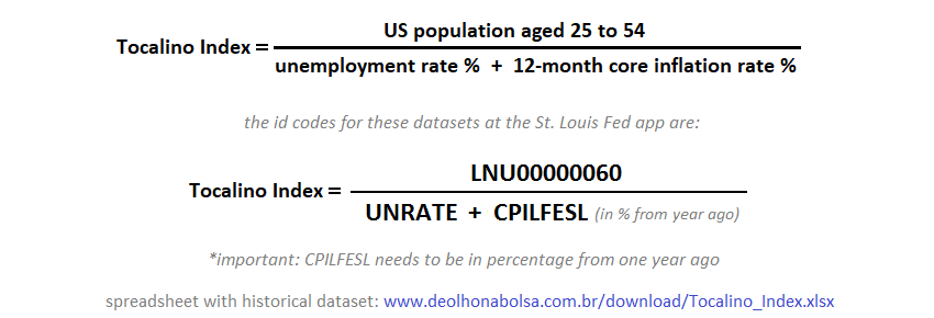
Conveniently, the St. Louis FRED provides a permanent link to the Tocalino Index dataset, from January 1959 to the latest available month, in CSV file or XLS spreadsheet.
Avoiding large numbers, indexed data to the end of 2005 is also available. This allows easier comparisons with other similarly indexed datasets. Here are the CSV file and the XLS spreadsheet where December 2005 is set to the value of 100.
The chart I used years ago can be seen next. It showed the Tocalino Index versus the Dow Jones Industrial Average adjusted to consumer prices. I will explain later why this CPI adjustment was not the right approach. In this study, both datasets were indexed to July 1990 = 100. To better understand my progress with this indicator, read the previous articles from 2014 and 2020.
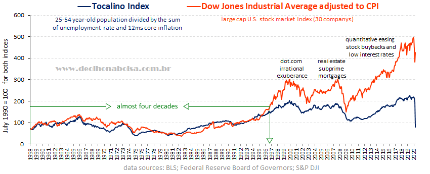
There was a promising correlation in the first four decades. But starting with the dot-com tech bubble at the turn of the century, the chart showed three major long-lasting discrepancies where stocks were much higher than the Tocalino Index. Adjusting the Dow Jones to the CPI was not a good idea. Instead, a measure of the money supply would have beem better. But it took me years to figure that out.
It was only in 2021 that the money supply was included as a fourth variable in the equation. This resulted in a more comprehensive and logical indicator.
Money supply:
As bartering is neither practiced nor feasible in modern society, money is what allows commercial transactions. Because of the multiplier effect of loans created by commercial banks, the M2 monetary aggregate represents a broader supply of dollars to the economy than the narrower monetary base or the M1 aggregate. The more dollars in M2, the more consumers will consume. Here is the monthly updated M2 data in CSV or XLS spreadsheet directly from the St. Louis Fed repository.
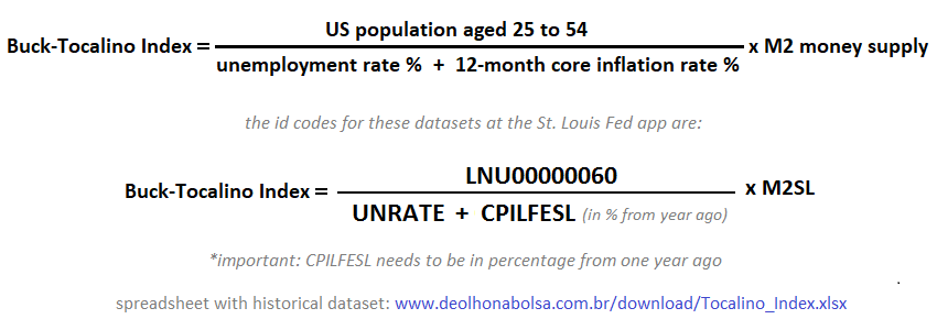
The old Tocalino Index, when multiplied by the M2 money supply, becomes a better indicator of the potential strength or weakness in the US consumer market. Since buck is slang for dollar, I call this modification the Buck-Tocalino Index. As President Dwight Eisenhower's Secretary of Defense said in 1954, "We get a bigger bang for the buck!" (Charles Erwin Wilson was talking about nuclear weapons at the time).
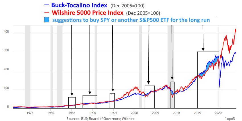
The chart below shows the Buck-Tocalino index and the S&P 500, both set to December 2005 = 100. Here are the St. Louis FRED permanent links to the monthly updated history of the Buck-Tocalino Index: CSV and XLS. And here is the indexed version, where December 2005 is equal to 100: CSV and XLS.
.png)
The correlation in the 21st century has improved a lot. The Buck-Tocalino Index suggests that stocks have not exceeded consumer market potential from early 2002 to early 2020. No sign of "irrational exuberance" for 18 years! On the contrary: from the beginning of 2015 to the start of 2020, the S&P 500 seemed undervalued relative to the Buck-Tocalino index. There was a 5-year non-stop suggestion to buy shares of an ETF that mirrored the S&P 500 (such as SPY, the world's most-traded fund). We cannot ignore the surprisingly short-lived market collapse at the onset of Covid. However, soon afterward, the S&P 500 reached higher historical levels. And it kept climbing higher. Last week, it set a new record at 5,354 points, apparently justifying the insistent suggestion for capital allocation, given by the Buck-Tocalino Index, throughout the second half of the last decade.
Judging by the Buck-Tocalino Index, since 1983, the stock market became overwhelmingly enthusiastic on two occasions only: from 1997 to 2002 (with the rise and fall of the dot-com tech bubble) and from 2020 to now (the era of Covid-UBI, extending to today's AI promises).
During Covid, central planners saw a unique opportunity to experiment with modern monetary theory and universal basic income. Relief checks were distributed to people. The outcome was a surge in inflation and distortions in asset values, including real estate. What at that time seemed like a free lunch is now being charged to the population. The increase in credit delinquencies and homelessness is evidence of this. The assets of many regional banks are now underwater, devalued by rising interest rates to fight inflation.
Artificial Intelligence is also fueling a lot of enthusiasm... Maybe too much.
During the subprime mortgage boom and subsequent 2008 global financial crisis, the former proximity of the S&P 500 to the Buck-Tocalino index suggests that stocks were not overvalued, unlike the present situation.
The Warren Buffett Indicator divides the total capitalization of the US stock market by the US gross domestic product. Agreeing with the Buck-Tocalino Index, Buffett's indicator did not suggest an overpriced stock market during that period. Most Americans were obsessed with the housing market. Foreign investors also eagerly invested in bundles of mortgage-backed securities. Presumably, the housing mortgage mania diverted money from the stock market in the early years of this century.
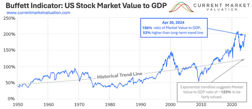
Both Buffett's and my indicators agree again. They corroborate the alert from persistently inverted yield curves: stocks may have reached too high.
We must remember that these deviations do not predict any imminent correction. Distortions can last long! Nevertheless, it is important to estimate the potential of the US consumer market. It impacts global trade, foreign labor markets, international reserves, worldwide dollar availability, and corporate debt rollover in different countries.
Much like M2 is a multiple of the US monetary base due to commercial bank loans, most dollars circulating the world are also created synthetically through offshore financing. The Eurodollar market is outside the jurisdiction of the Federal Reserve or any other central bank. However, the US consumer market still affects the liquidity of dollars (or eurodollars) abroad. Jeff Snider can explain this further on the Eurodollar University website and YouTube channel.
It is also interesting to see that despite all the erratic bipolar swings of the stock market, it tends to revert and fluctuate closer to consumer market potential. This is not a technical analysis. These are fundamentals of the economy prevailing in the long run.
The next chart shows the broad-base Wilshire 5000 Price Index versus the Buck-Tocalino Index. Every time the blue line of my indicator is seen above the red line of the stock market it suggests an interesting opportunity to buy stocks (or preferably shares of an ETF that mirrors the S&P 500).
There's a reason I still keep the old Tocalino Index (without M2) in my toolbox. The problem with long-history stock charts is that the past becomes too small to observe. For a more detailed look, either we zoom in on shorter periods or use a logarithmic scale. However, in a simple static chart, we can use the old Tocalino Index and compare it to the stock market data divided by the M2 money supply. It is a simple arithmetic procedure: instead of multiplying one side of the expression by M2, we divide the other by it. The equivalence of the expression remains, but the vertical scale is greatly reduced. This will efficiently show past and present details more proportionally.
This is what I mean:
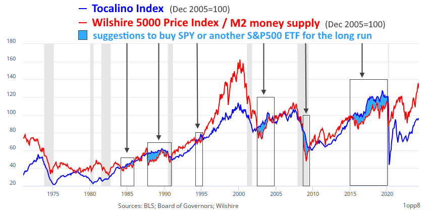
Despite being displayed differently, the two graphs above convey the same data. The second chart shows all historical discrepancies in greater detail, while the first chart highlights the long-term historical correlation between the stock market and the Buck-Tocalino Index.
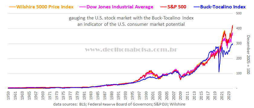
I have successfully compared the Buck-Tocalino Index with three major stock market indices. All three are capitalization-weighted and show a similar behavior:
Those interested in analyzing, updating, or publishing the Buck-Tocalino and Tocalino indices on their websites or documents, may download this updated spreadsheet, with all historical data for both indicators, plus the S&P 500, Dow Jones Industrial Average, and Wilshire 5000 Price Index. Last week, the Saint Louis Federal Reserve's data repository stopped publishing all Wilshire 5000 Price Index data. Years ago, it also limited the S&P 500 and Dow Jones datasets to a maximum of 10 years. With that in mind, maintain your own backup records for security.
Below are the lastest months published by the St. Louis Federal Reserve Economic Data:
https://fred.stlouisfed.org/graph/fredgraph.xls?g=1p9Ry
 leia outros artigos
 read other articles

